To start out, the User Interface (UI) changes in PeopleTools 8.59 are very good! There is a difference between seeing screenshots and using the application. The improvements to search make it a great navigation tool and navigating the system is more fun with updates to the Navigator and the new Quick Access Bar. I am excited to use applications on PeopleTools 8.59 after getting some hands-on time with the changes.
I have compiled is a list of changes and improvements that I think have the biggest impact, including some that were not talked about by the PeopleTools team.
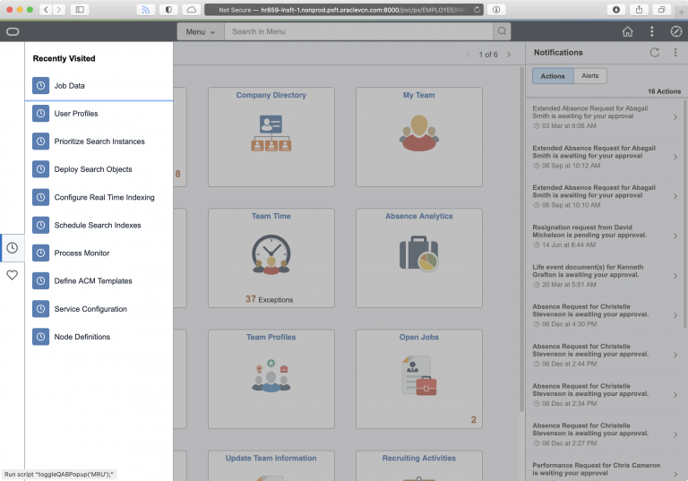
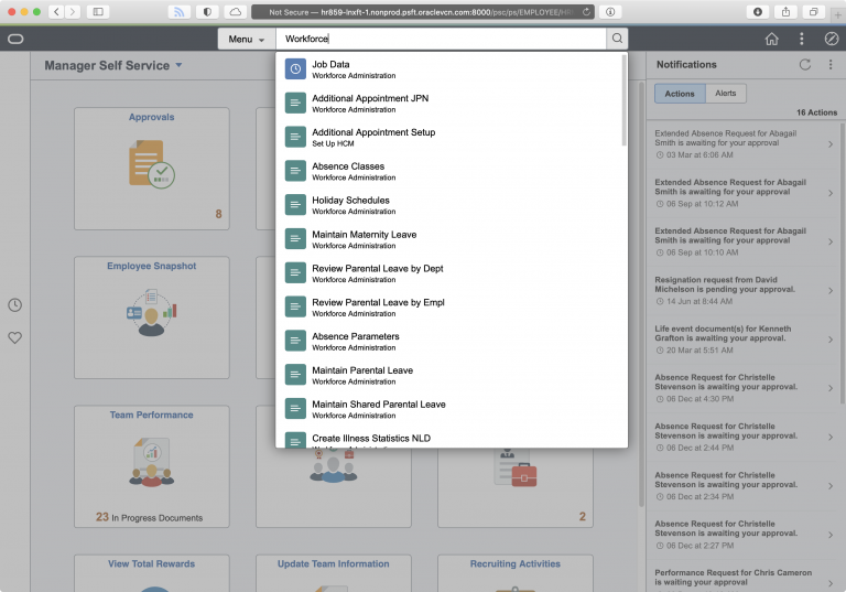
Quick Access Bar
I really like this new Quick Access Bar. On the homepage, it sits on the left-hand side of the page and your favorites and recent places are just a click away. Getting these two collections of links out of the NavBar is a good change.
The Quick Access Bar is only the home page. I found myself wishing the Quick Access Bar was static on every page. I’m sure that would be some UI issues with Nav Collections, Work Centers, etc, but I think a persistent Quick Access Bar would be quite useful.
Breadcrumbs
In the Navigator, I’m excited that breadcrumbs are back! I think the way breadcrumbs are implemented is well done. In previous versions of the Navigator, there was a “Back” and “Top” buttons that you could use to move up the folder paths. This was functional but you don’t always know where you are in the Navigator. To be fair, the intent with Fluid Navigation is to use Nav Collections, Tiles, and Work Centers instead of the Navigator, but the Navigator still gets lots of use.
The breadcrumbs in 8.59 replace the “Back” and “Top” buttons.
I like this much better because you can go back to any point in the navigation hierarchy with just a click.
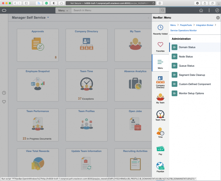
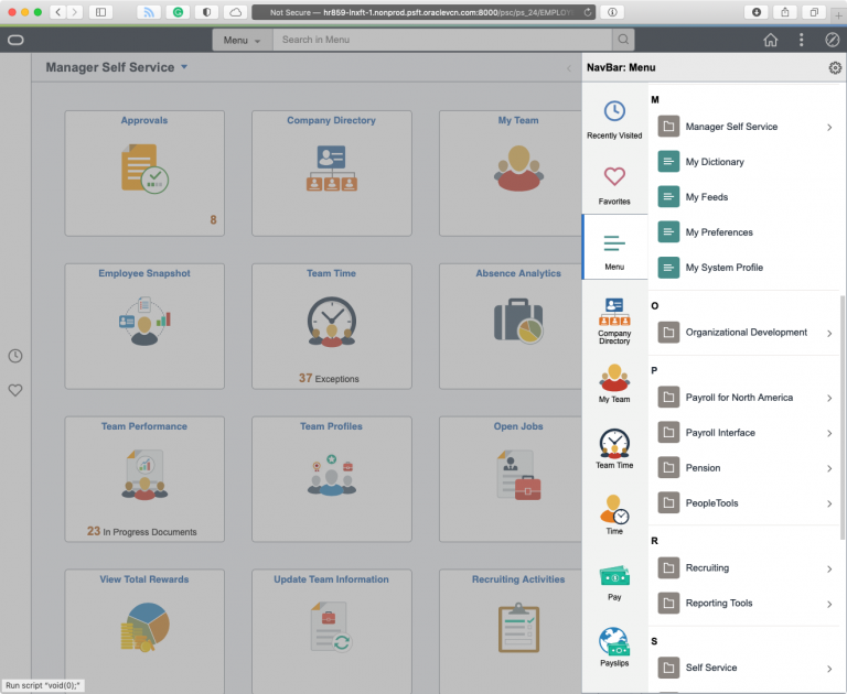
Alphabetical Sorting
The Navigator can now be sorted alphabetically, or use the original sorting. This does return another feature from previous versions of PeopleTools, but it’s a welcome change. I’ve worked at organizations that spend time customizing the Menu to be alphabetical. As a frequent user of the PeopleTools folder, I appreciate that both sorting options are offered.
I also like that the alphabetical sorting option has groupings for each letter to make it easier to find the folders you are looking for.
New Icons
The icons throughout the Homepage, Search Bar, NavBar and Quick Access Bar have a new clean, and simple look. The icons for folders and content references are distinct and the use of color is helpful. The icons are also present in the search results and a Recent Items icon in the search bar helps you easily find what you are looking for.
I would like to see this icon style adopted by the default tile images to provide a stronger brand feeling.
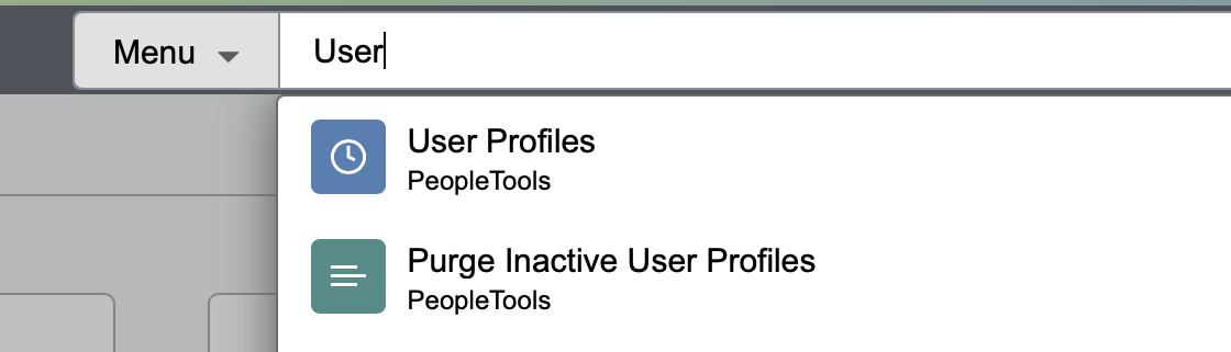
Search Bar
On the Homepage, the Search Bar is featured at the top. I like the ever-present search bar; it is quicker to use and having the search bar waiting for you feels more like a search-driven UI. The menu search seems much faster, the type-ahead searching is responsive, and the ability to enable Real Time Indexing on the Recent Places items is very useful.
Notifications and Fluid Search Results
Notifications are now prominent on the Homepage in their own right-hand pane. I think this is a great change that will hopefully drive more adoption for notifications within PeopleSoft. Clicking on a notification will bring you to the page that needs your attention. But you can also view all of your Notifications as a collection. This new view has some interesting UI changes in 8.59 that are good and bad.
First, in the header, there are new forward/back buttons that will take you through the list of work. These exist elsewhere in 8.59 on Fluid Pages. (The Real Time Indexing page is where I also saw this behavior). The continues a trend in PeopleTools where action buttons are moved into the Header. In classic pages, the action buttons are mostly at the bottom of the content page. I like the forward/back buttons when working through a list.
Second, the normal header buttons are hidden behind the Action Menu. I don’t like this. If I’m working through a list of notifications and I’m done, my next action is to go somewhere else in the system (or log off). The Home, Search, and NavBar buttons are now buried under an extra click. I feel the Home and Search buttons should always be visible to users; the NavBar makes sense to hide if you short on space in the Header.
Third, from time to time the left also minimizes to a yellow bar on the left-hand side. This doesn’t seem to replace the little “tab” when collapsing the left-hand pane in Nav Collections, it does seem to show when the page is wider than your browser to give you some extra screen real estate. The inconsistency is throwing me off, but maybe that’s because this is all new.
[UPDATE: 4/13/2021]
I can’t believe I posted this blog post without calling out the Process Monitor changes!
Process Monitor
The Process Monitor has the most changes I have seen since working with PeopleSoft! (8.4 was just released when I started my career). There is now “Clear” button to remove any filters you have added, and “Reset” button to set the Process Monitor back to default settings. Both buttons are long overdue!
There is a new field on the Process Monitor grid that gives you quick access to pages under the Details page. You don’t save any clicks, but the Action menu is faster than loading a subpage and clicking another link.
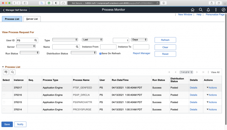
These are good changes and it’s nice to see a page that is used by so many users given some love. I’d call it Process Monitor 1.1. The PeopleTools team could take some more cues from the Process Monitor 2.0 project.
Pingback: PeopleTools 8.59 UI Changes | PeopleSoft Career