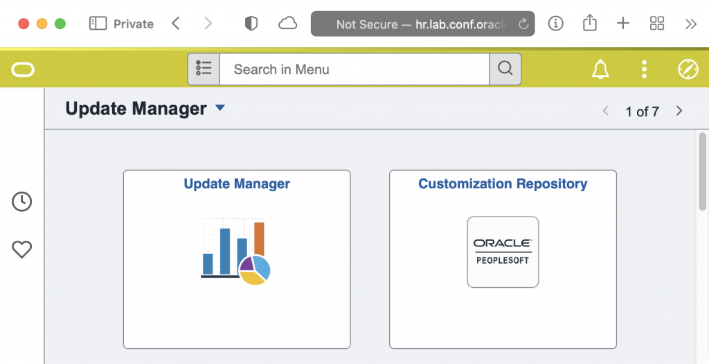
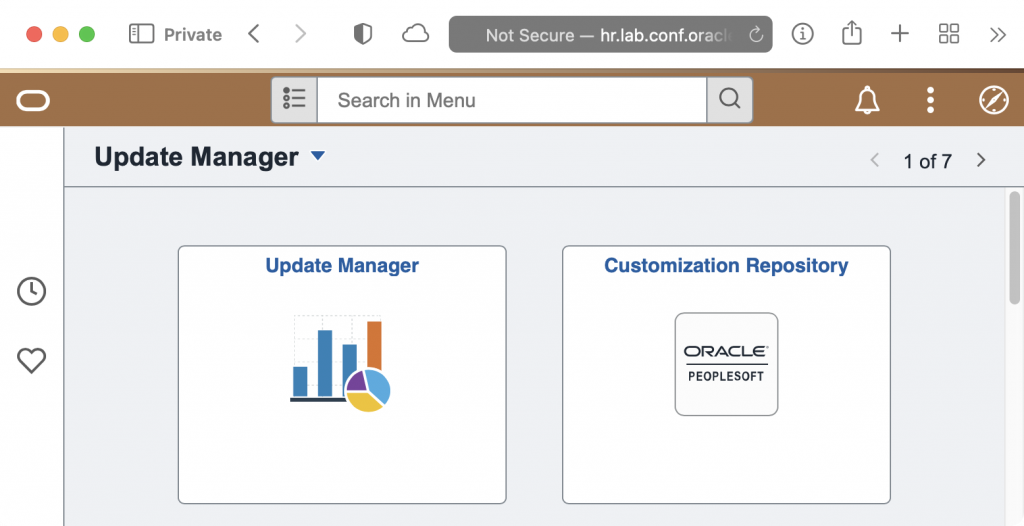
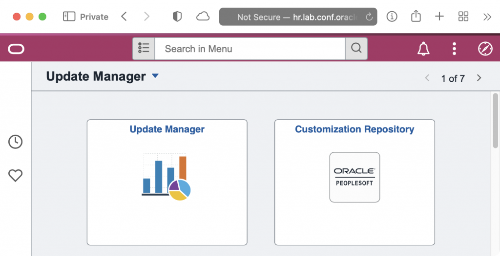
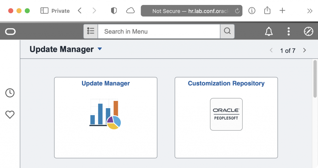
We are releasing our newest version of our Themes for PeopleSoft 8.59 (and 8.58). We use these stylesheets on our non-production environments so that users can easily recognize which environment they are in, and most important, know they aren’t in production.
The Themes are released as an Application Data Set that you can easiliy import into your applications. The ADS project includes stylesheets and Branding Themes.
Importing Themes
Download the new themes from the Github respository. Under the Releases, you can download the lastest IO_STYLE_859.zip release. Unpack the zip file to your Data Migration File Location.
You use the Data Migration Workbench’s “Load Project From File” feature to import the themes and stylesheets.
Assigning Themes
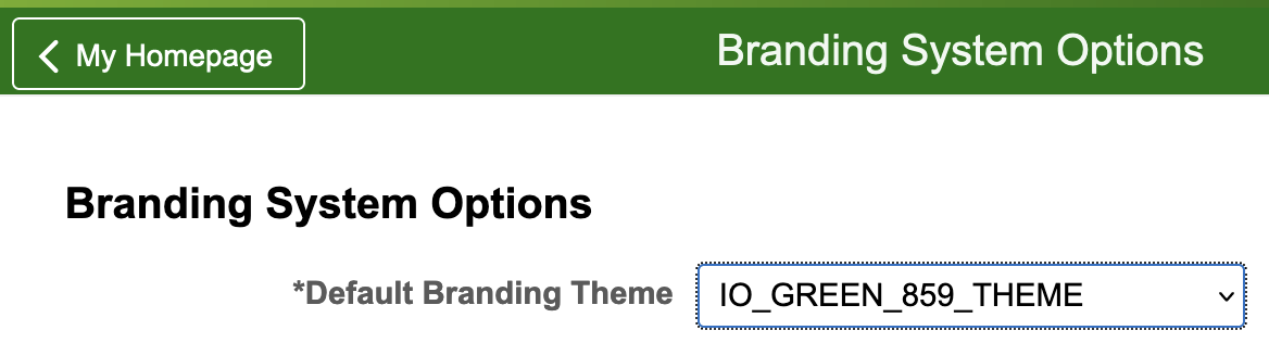
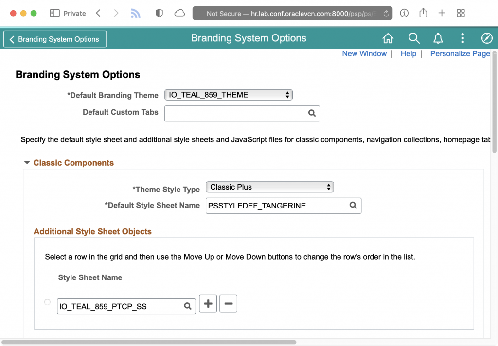
To set the main theme for your system,
- Navigate to
PeopleTools > Portal > Branding > Branding System Options - Select the
IO_theme of your choice. - You will also need to add a stylesheet for Classic Plus. Add the cooresponding
IO_<color>_859_PTCP_SSas an additional stylesheet.
- If you have set Theme Assignments, you can update those as well under
PeopleTools > Portal > Branding > Assign Branding Themes
SQL for Refreshes
Typically, the IO_STYLE_859 is load into production but not used. During your refresh, you can use the following SQL to configure your new environment to use a theme.
UPDATE sysadm.psoptions
SET
    ptbrandtheme = 'IO_GREEN_859_THEME',
    themestyletype = 'PTCP';

TRUNCATE TABLE sysadm.psoptionsaddl;

INSERT INTO sysadm.psoptionsaddl
VALUES (
    'C',
    'CSS',
    'IO_GREEN_859_PTCP_SS',
    0
);
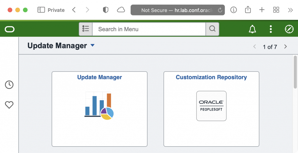
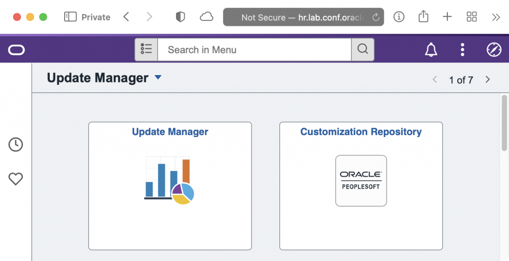
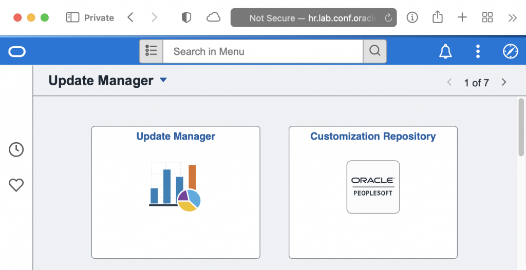
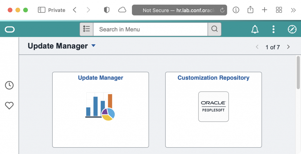
Colors
If you are just starting these stylesheets for your non-production environments, here is a suggestion for how to color code environments. This is how I use the colors:
| Environment | Color |
|---|---|
| Development 1 | Green |
| Development 2 | Teal |
| Development 3 | Blue |
| Test | Red |
| UAT/QA | Grey |
| Sandbox | Brown |
| Project 1 | Purple |
| Project 2 | Pink |
| Project 3 | Yellow |
I used https://colordesigner.io/ to help build the color schemes.
Orange
| Primary | Dark | Light | Accent |
|---|---|---|---|
| #FF8100 | #FF5100 | #FFAA00 | #004757 |
Red
| Primary | Dark | Light | Accent |
|---|---|---|---|
| #94090D | #5C0002 | #D40D12 | #1dfff9 |
Green
| Primary | Dark | Light | Accent |
|---|---|---|---|
| #097609 | #075807 | #70AF1A | #591aaf |
Purple
| Primary | Dark | Light | Accent |
|---|---|---|---|
| #553285 | #36175E | #9768D1 | #a2d168 |
Blue
| Primary | Dark | Light | Accent |
|---|---|---|---|
| #0074D9 | #00448D | #7ABAF2 | #f2b27a |
Teal
| Primary | Dark | Light | Accent |
|---|---|---|---|
| #009798 | #227273 | #9DF3F4 | #f49e9d |
Yellow
| Primary | Dark | Light | Accent |
|---|---|---|---|
| #CCCC04 | #8d8d03 | #FFFF52 | #5252ff |
Brown
| Primary | Dark | Light | Accent |
|---|---|---|---|
| #A36F44 | #6B4732 | #F7DEB2 | #b2cbf7 |
Pink
| Primary | Dark | Light | Accent |
|---|---|---|---|
| #AA3366 | #552233 | #CC5599 | #55cc88 |
Grey
| Primary | Dark | Light | Accent |
|---|---|---|---|
| #707070 | #3B3B3B | #BABABA | #FD7400 |
Hi Dan,
We used to use themes for this purpose at A&O but since 8.58 have used the Company Banner to achieve the same thing. The banner is only displayed if you are in a non-prod environment or have a specific role (in production) so sysadmins with prod access see a bright red banner for prod.
The other advantage of this is that you can take prod-like screenshots for documentation etc and simply crop out the company banner to make it look like prod.
Anyway, just an alternative idea.
Thanks
Dave
Yes, the Company Info banner is a good option too. In fact, we are planning on using both the banner and the color stylesheets. Our users (and myself) have really come to like how easy it is to identify which environment you are in just based on the color. For a while after our upgrade (and before I developed these), the most common question I got from our users was when the stylesheets would be ready. They were nervous when accessing our non-prod environments because they were so used to having the bright colors to know where they were working.
I do like that you can stash information in the Company Info banner too, like database name and the refresh date for the environment. I haven’t run across too the screenshot situation you mention often, mostly during big upgrades, but I do see how that would be a benefit for your support teams to send prod-like screenshots out. I guess that’s where you could use the Theme Assignments feature. Create a role that you can assign specific people (or a group during testing/etc) where those users get the default branding but everyone gets the colors in the headers.
Pingback: #325 – psadmin.io Themes
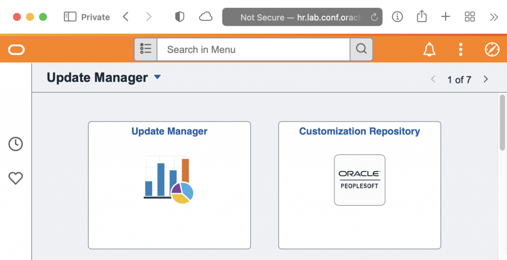
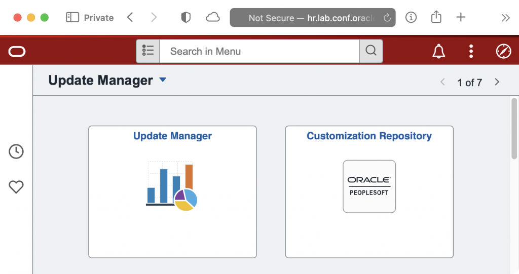
In addition to the environment colour scheme, we have a small event mapping attached to the Fluid Homepage that adds 1 of 6 transparent background PNG images via stylesheet to the homepage so when a uses gets in, there is no mistaking where they are.